All categories
Paysera HQ

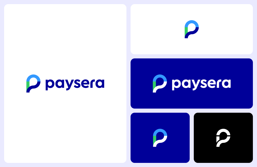
Paysera introduces a new logo, changes visual identity

#
The financial technology company Paysera launches a new logo and new tagline: "One app – endless possibilities". This change reflects the shift of services to a super app and the geographical expansion into global markets.
#
The long-awaited revamp is the first step towards a new visual identity. The new version of the logo will be introduced gradually on all Paysera platforms – the mobile app, online banking, etc. Over the course of the year, Paysera will update the design of the payment window for e-shops and launch a new, more user-friendly website.
Justina Sidlauskiene, Head of Marketing at Paysera, says:
"There were more than enough reasons to change the logo - our geography and goals have significantly broadened. Millions of e-shoppers see this logo when shopping online. Our network of companies in Europe stretches across ten countries and is constantly expanding. We have employees on four continents, and if you point your finger at the world map, you're likely to come across a place where we have clients. Finally, we are making a distinct shift in our app concept from an app for transfers and payments to a super app – a single platform where you can pay for parking, invest in real estate projects, call a courier to pick up a parcel, and more."
The new Paysera logo features a new symbol – a stylised "P", which is an allusion to the chat icon, and at the same time, resembles the location pin used on maps.
"The chat icon symbolises dialogue with businesses and the people who create them. It is a promise expressed in a visual language to listen and, most importantly, to hear our clients, with whom we communicate in 16 languages, including English 24/7.
The "P" icon's resemblance to the location pin symbolises the global perspective of our financial services with the attention to detail of local companies - i.e. although we are a multinational fintech, we want the Paysera brand to be introduced to different countries by local entrepreneurs who have the best knowledge of their country's mentality, and the local market's exact expectations for financial and related services," says the Head of Marketing at Paysera.
When developing the logo, the colour scheme was completely redesigned. New colours were introduced – deep blue and sky blue – to signify robustness, stability and to reflect the company's many years of experience. The choice of green represents the company's focus on sustainable solutions.

About Paysera

Paysera is a fintech company that provides fast, convenient, and affordable financial and related services globally. We offer products ranging from a payment gateway for e-shops to money transfers, currency conversion, payment cards, an event ticketing platform, a parcel locker network (to be launched in 2021), and a top-notch finance management app.

Beginning our journey in 2004 in Vilnius, Lithuania, we are the first licensed e-money institution (EMI) in Lithuania, with 300 people working in 15 different cities worldwide. With over one million app installs and growing, we aim to push the boundaries and become an industry-leading super app that provides financial and lifestyle services across the globe.

More information

Aleksas Rozentalis
Communication Project Manager
Paysera LT
Tel. +370 615 29 097
El. p.: [email protected]